100 Diagrams which Changed the World
Written by John Worne
Reading ‘100 Diagrams’, I’ve come to the conclusion that I really like a picture with my words…
Maybe it’s the result of blogging; or the changing relationship between photos and text as screens improve and social media goes visual. Perhaps the immediacy of the modern world is best navigated with a picture? Perhaps it always was.
Whatever the future holds, this tour of the great diagrams which changed, captured or encapsulate history, is well worth a look. Not the best written of its type, I have to say – and talking of type why have tiny and grey text; to test the eyesight?
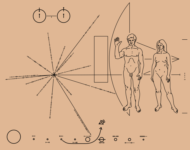
But all the great inventions and diagrams are here – Copernicus, Galileo, the key patents of the industrial revolution, propaganda posters, the world wide web, the first bar chart; right back to schematic maps from ancient civilisations.
My favourite, below, is Sir Isaac Newton’s own sketch of the ‘crucial experiment’ which proves white light is composed of different colours; but those colours themselves cannot be further split. What science (or Natural Philosophy) then thought was fundamental – white light – in fact is a composite. What is fundamental, as so often in science, lies underneath.

Packed with the complex made simple, the pictures more than make up for any shortcomings with the text.
100 Diagrams That Changed the World
Related
Posted in Life of the Mind
- Previous Post Deep Drama: Crimson Tide and Das Boot
- Next Post Butterflies – M.C Escher
